
In the first part of our X-Maze tutorial we created an Ionic project with three components called “Arrow-Buttons”, “Decoration” and “Maze”.
Today we we start to fill these components with content and make everything look pretty.
Part 2: Make it look pretty
Arrange the ArrowButtonsComponent
Let’s fill the ArrowButtonsComponent with a few buttons. For this we remove the automatically generated placeholder entry in arrow-buttons.component.html.
<p>
  arrow-buttons works!
</p>
and replace it with this:
<!-- Button group for portrait mode -->
<ion-grid id="buttons-portrait"
  *ngIf="isPortrait">
  <ion-row>
    <ion-col size="12">
      <ion-button expand="block">
        <ion-icon name="md-arrow-round-up"></ion-icon>
      </ion-button>
    </ion-col>
  </ion-row>
  <ion-row>
    <ion-col size="6">
      <ion-button expand="block">
        <ion-icon name="md-arrow-round-back"></ion-icon>
      </ion-button>
    </ion-col>
    <ion-col size="6">
      <ion-button expand="block">
        <ion-icon name="md-arrow-round-forward"></ion-icon>
      </ion-button>
    </ion-col>
  </ion-row>
  <ion-row>
    <ion-col size="12">
      <ion-button expand="block">
        <ion-icon name="md-arrow-round-down"></ion-icon>
      </ion-button>
    </ion-col>
  </ion-row>
</ion-grid>

<!-- Button group for landscape mode -->
<ion-grid id="buttons-landscape"
  *ngIf="!isPortrait">
  <ion-row>
    <ion-col size="2">
      <ion-button expand="block">
        <ion-icon name="md-arrow-round-up"></ion-icon>
      </ion-button>
    </ion-col>
    <ion-col size="8"></ion-col>
    <ion-col size="2">
      <ion-button expand="block">
        <ion-icon name="md-arrow-round-down"></ion-icon>
      </ion-button>
    </ion-col>
  </ion-row>
  <ion-row>
    <ion-col size="2">
      <ion-button expand="block">
        <ion-icon name="md-arrow-round-back"></ion-icon>
      </ion-button>
    </ion-col>
    <ion-col size="8"></ion-col>
    <ion-col size="2">
      <ion-button expand="block">
        <ion-icon name="md-arrow-round-forward"></ion-icon>
      </ion-button>
    </ion-col>
  </ion-row>
</ion-grid>
We have created two different button groups based on ion-grid. Depending on the orientation of the screen, one or the other group should be displayed. This is ensured by the *ngIf instructions.
For these to work, we need to program the appropriate logic. In arrow-buttons.component.ts we add this:
import { Component, OnInit } from '@angular/core';

@Component({
  selector: 'app-arrow-buttons',
  templateUrl: './arrow-buttons.component.html',
  styleUrls: ['./arrow-buttons.component.scss'],})
export class ArrowButtonsComponent implements OnInit {

  public isPortrait: boolean;

  constructor() { }

  ngOnInit() {
    this.checkOrientation();
  }

  private checkOrientation() {
    var mq = window.matchMedia("(orientation: portrait)");
    this.isPortrait = mq.matches;
    mq.addListener(m => {
      this.isPortrait = m.matches;
    });
  }

}
With the help of some CSS, we position our button groups in arrow-buttons.component.scss as overlays:
#buttons-portrait {
  position: absolute;
  bottom: 10px;
  width: 100%;
  z-index: 1001;
}

#buttons-landscape {
  position: absolute;
  top: 50%;  transform: translateY(-50%);
  width: 100%;
  z-index: 1001;
}
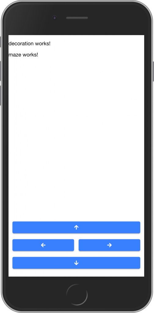
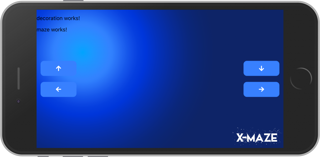
If the screen is in portrait orientation, the buttons are placed in a group at the bottom of the screen (see following figure).
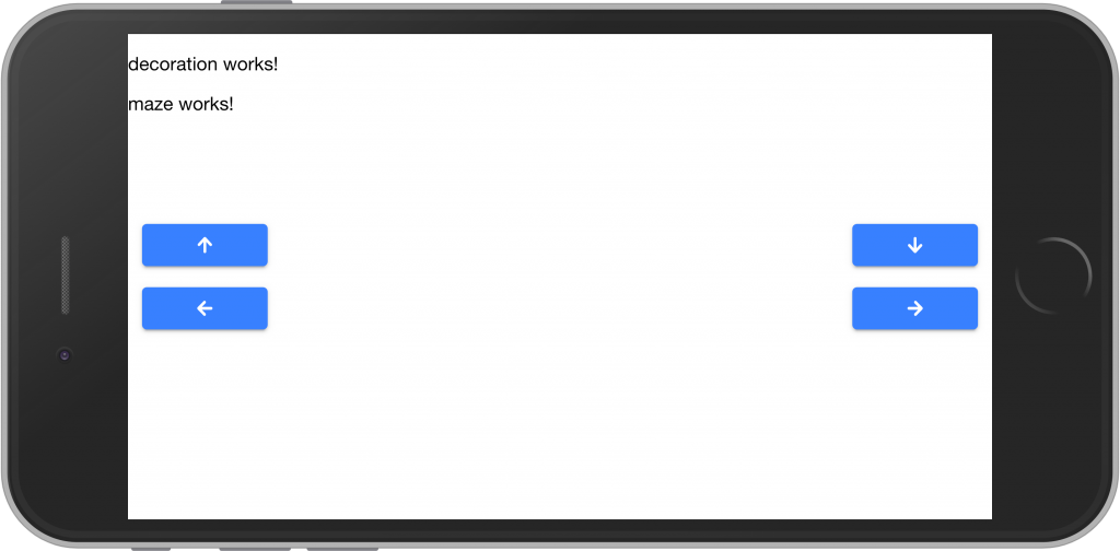
If the screen is in landscape mode, the buttons are placed in the middle of the left and right edges of the screen. There they are good for gamer thumbs to reach 😉 (see following figure).
Assets
To make our app pretty, I’ve prepared some graphics that you can download here:
background.svg
decoration.svg
maze.svg
title.svg
Copy background.svg and title.svg into the assets folder of our app project (you can delete the file shapes.svg at the moment).
Did I already say that I love Scalable Vector Graphics (SVG)? Why? You can read the answer in my Ionic 4 book in chapter 8.8.
A few cool things that you can do with SVGs I’ll show you in this tutorial, too.
Background
First of all we want to use the background.svg file as a background in our app. To do this, we enter the following in home.page.scss:
ion-content {
  --background: url(../../assets/background.svg) no-repeat 50% center/cover;
}
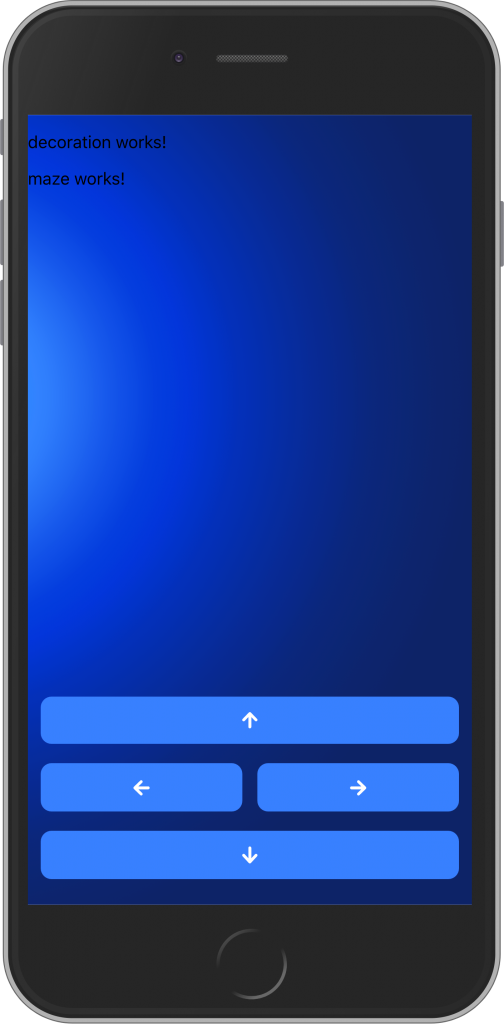
Before I explain for long what this CSS instruction does, look for yourself:
Title
We want to place the title now. You remember: In home.page.html we have a <div id=title></div> (see the first part of our X-Maze tutorial). That’s the placeholder for our title.
For this we write the following CSS in home.page.scss:
@media screen and (min-height: 500px) {
  #title {
    content: url(../../assets/title.svg);
    position: absolute;
    top: 0px;
    left: 50%;
    transform: translateX(-50%);
    width: 50vw;
    @media screen and (min-height: 600px) {
      width: 80vw;
    }
    @media screen and (min-height: 700px) {
      top: 20px;
      width: 90vw;
    }
    @media screen and (min-height: 800px) {
      top: 40px;
      width: 100vw;
    }
    z-index: 1000;
  }
}

@media screen and (min-width: 500px) {
  #title {
    content: url(../../assets/title.svg);
    position: absolute;
    bottom: 5px;
    right: 5px;
    width: 20vw;
    z-index: 1000;
  }
}
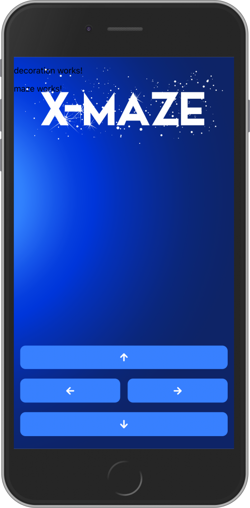
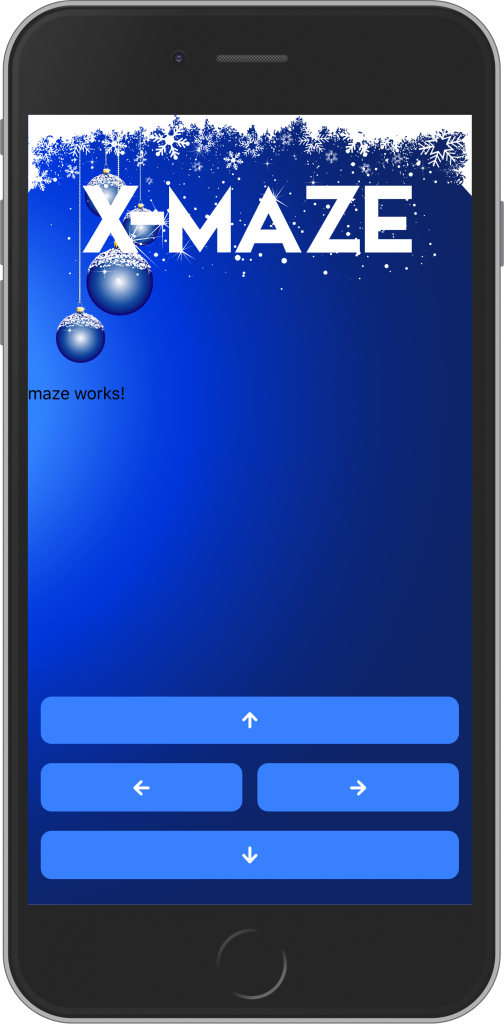
With these instructions, we assign title.svg to our title div and determine that depending on the size (and orientation) of a screen, our title will either be centered at the top…
… or at the bottom right.
Decoration
Let’s make the DecorationComponent what its name promises: a decorative component.
To do this, we copy the entire contents of decorations.svg and paste it into decoration.component.html.
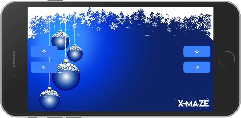
You wonder why you pack this SVG stuff into an HTML component? Well, then start our app and be amazed:
And thanks to the wonderful features of SVGs, the whole thing looks great in the landscape view as well (and on a huge screen, too):
Maze
Last but not least, we fill the MazeComponent. Here we proceed exactly as we did with the DecorationComponent: We copy the entire contents of maze.svg into maze.component.html.
That’s the result:
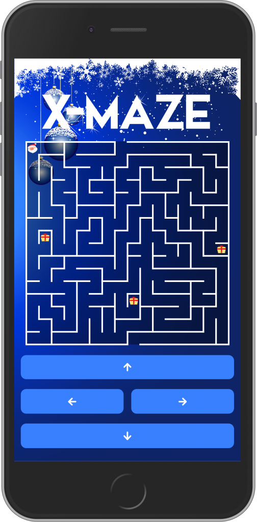
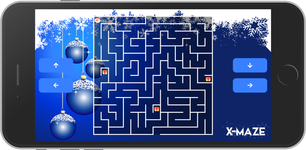
Now our UI is ready. Looks great, right?
You’ve discovered Santa Clause in the labyrinth and you’re curious what he’s looking for there? Then look forward to next Sunday, where we’ll get Santa up and running.
Until then:
Happy reading and coding!
Pingback: How to make an X-Maze with Ionic 4 (4/4) – Ionic Books
Pingback: How to make an X-Maze with Ionic 4 (3/4) – Ionic Books